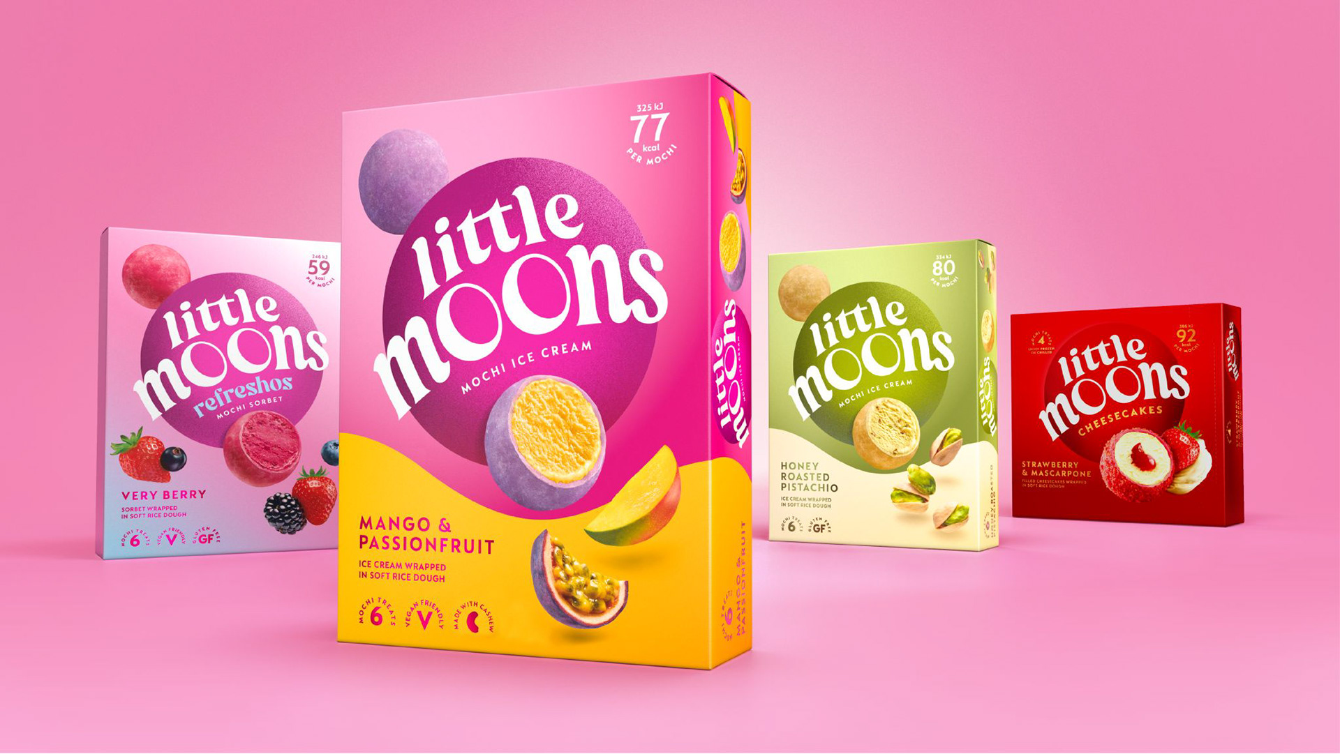
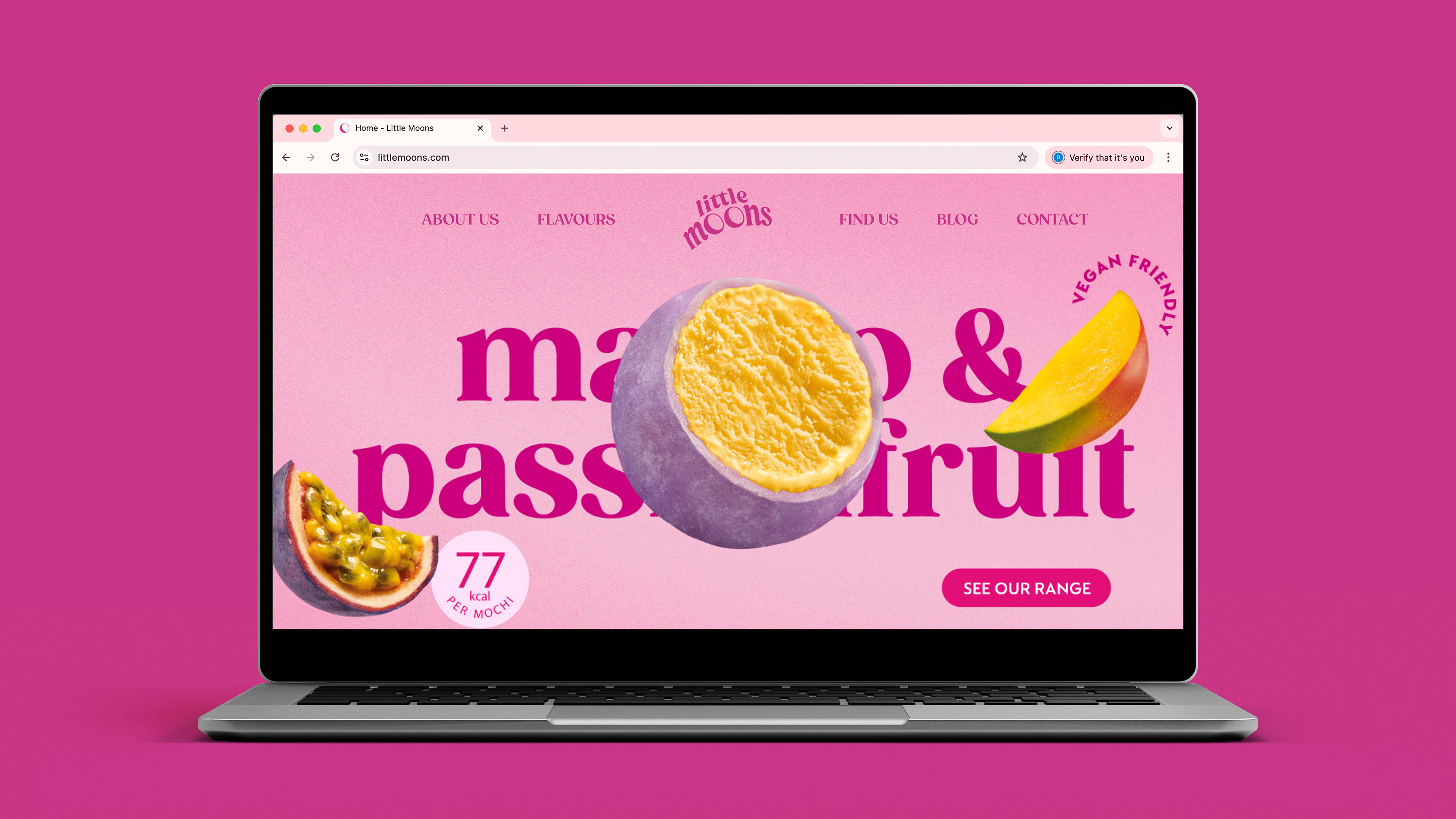
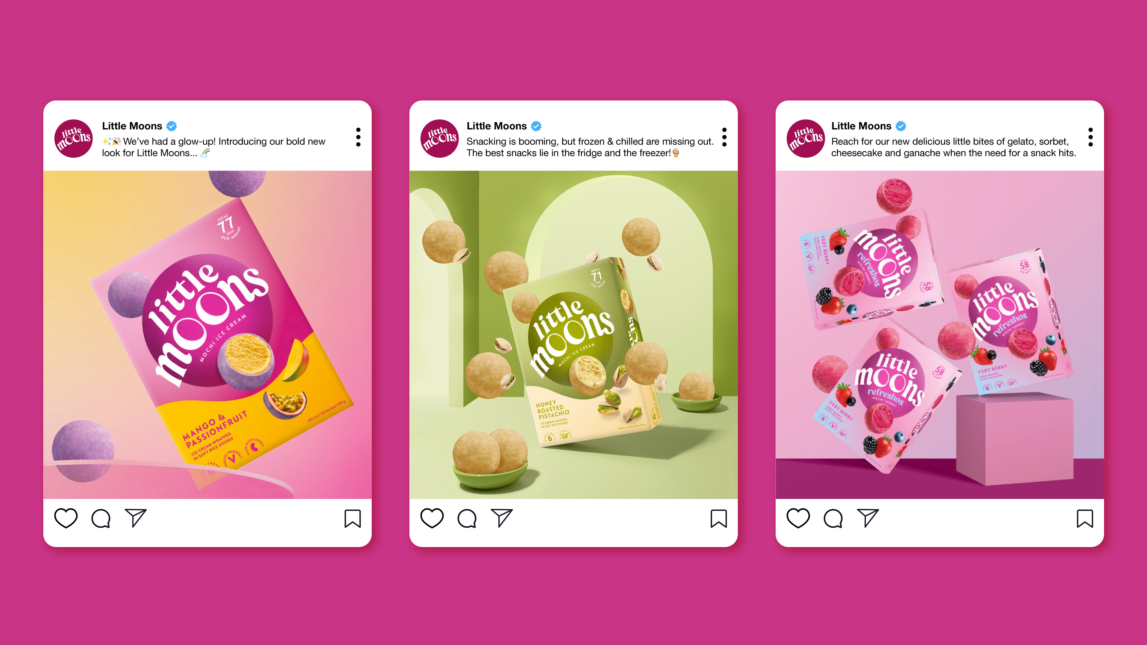
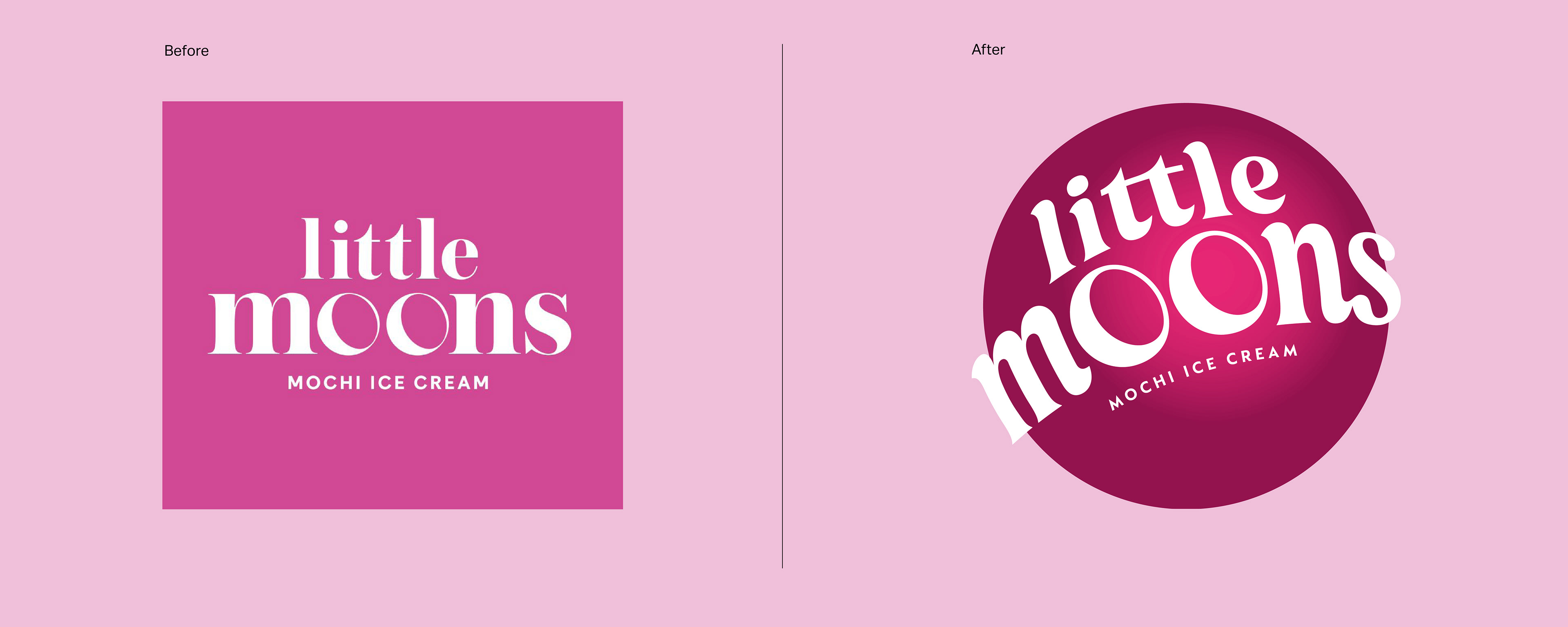
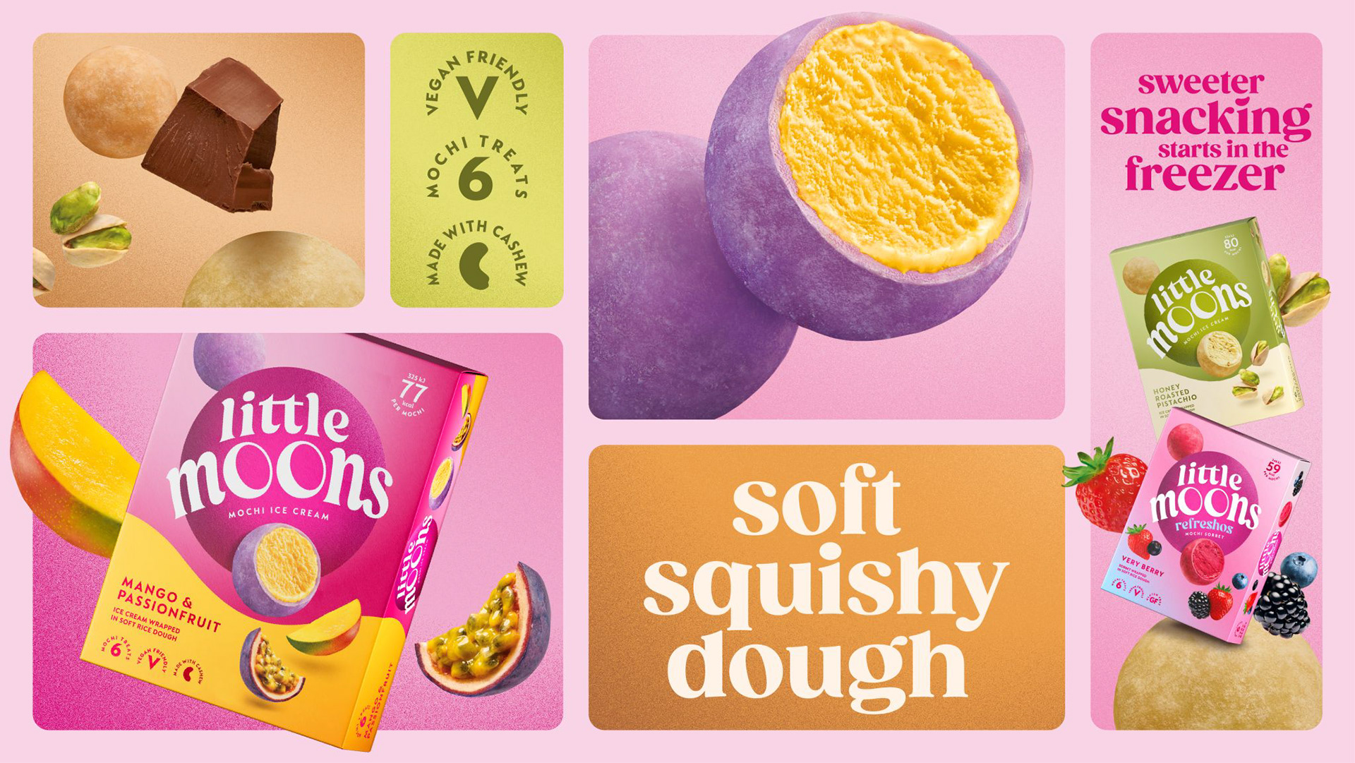
The redesigned packaging features vibrant colours, playful imagery, and emphasizes the quality of their ingredients, aimed to stand out in the competitive snacking market. We created an adaptable and fit-for-future design system that combines fixed assets with flexible, flavour-specific components. This enables agencies to create distinctive designs for different markets that feel consistent, 'sing' on-shelf, with the new Little Moons brand assets at their core.
Little Moons Rebrand
Little Moons has recently rebranded, launching a new 'brand world' aimed at enhancing its appeal to a wider range of snack consumers. The brand has evolved to give a contemporary appeal for a wider audience, injecting a sense of ‘fun and play’ to match current levels of ‘luxurious and premium’. This rebrand is part of a broader strategy to compete with larger and established sweet snacking brands, not just other ice cream brands. Instead it wants to take on biscuits, chocolates and bakery brands in the wider category, building on previous success with the goal of becoming a major player in European markets.